

Page Under Construction
About Third Hands Co.
What I learned going in and what I noticed about the client
Third Hands Co. was a client that was highly dedicated and projected the stance of their own philosophy to their core. They were a client who was incredibly easy to work with, provided information that was not only helpful but also did not need to be asked for, and presented themselves as humble. You do not get these kinds of clients all too often.
Who are they and what does that look like?
We focused on the client and their hopes for their business to really help the busy people in our lives. The client herself was very caring, determined, strong-willed, and motivated; honestly, her place was spotless, and her own presence was clean and well put together. We always aim to connect the overall “look” of a brand or website to the overall “look and feel” of how the client presents themselves.
A website and brand are only that until they’re connected to the client; then it becomes a story.

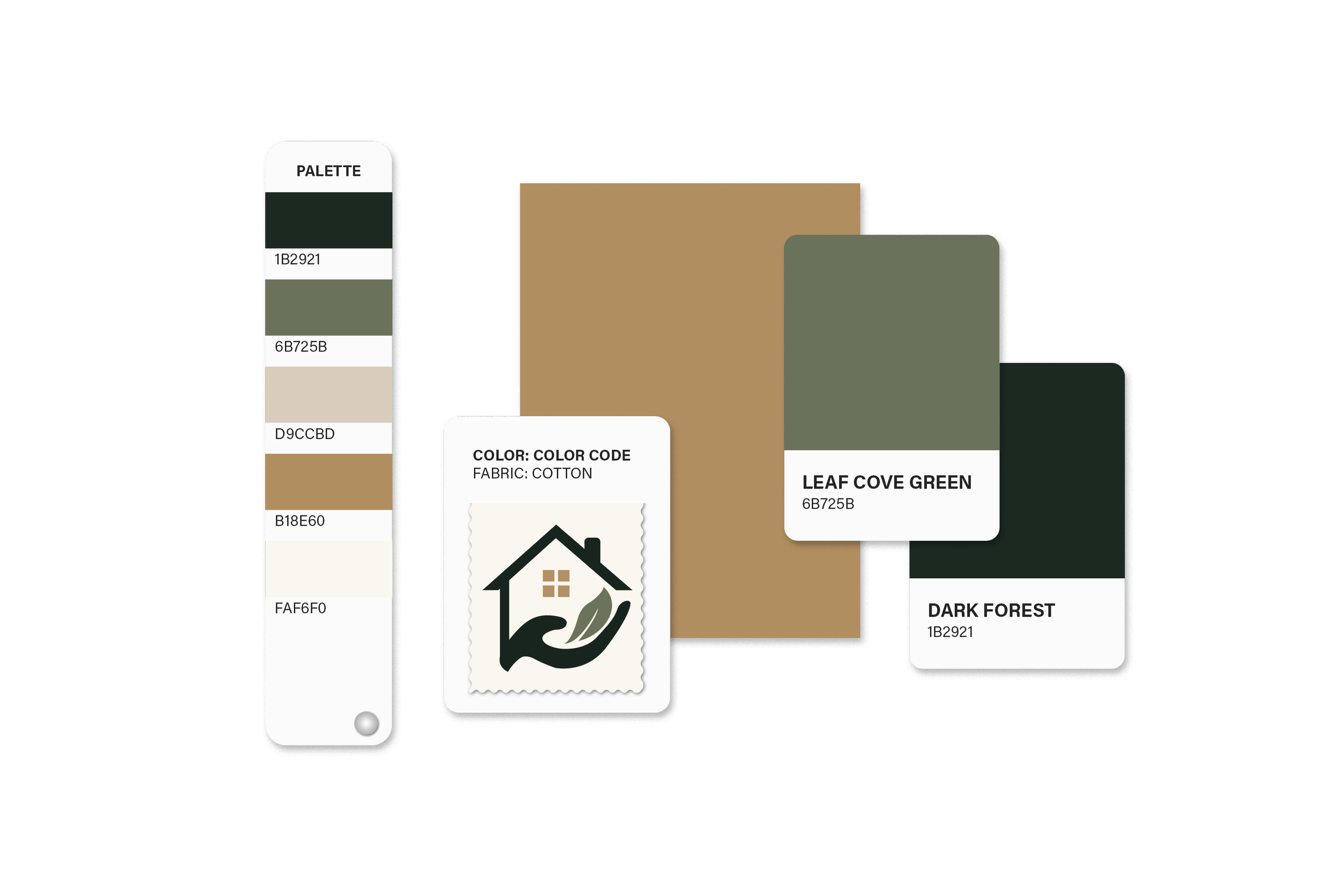
Colour Palette
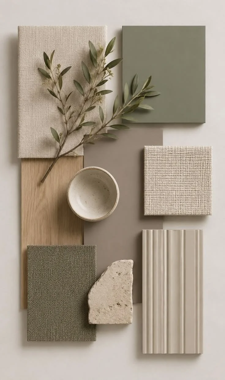
The client chose the colour palette, which reflected the calming, professional imagery they wanted to establish for their brand.
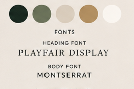
Typography
The Client had chosen Playfair Display and Montserrat as their typography for their branding.
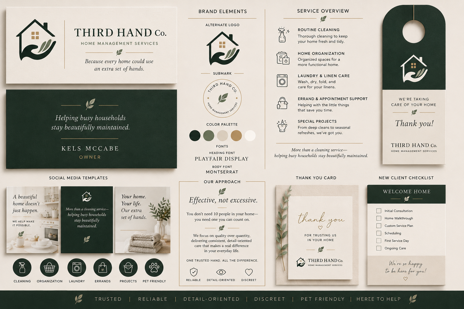
Logo and Other assets given
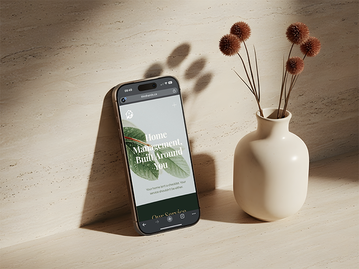
Third Hand Co. shared this image (left) as the website's “vibe” and said they were willing to make minor logo changes to better match the relaxed, down-to-earth style they wanted.
We took this into consideration while adapting the minor changes to the logo itself and developing the concepts for the website.
For the logo itself, we removed the two fingers, simplified the hand, and replaced it with a leaf to stick to the brand and minor themes the client wanted to keep.
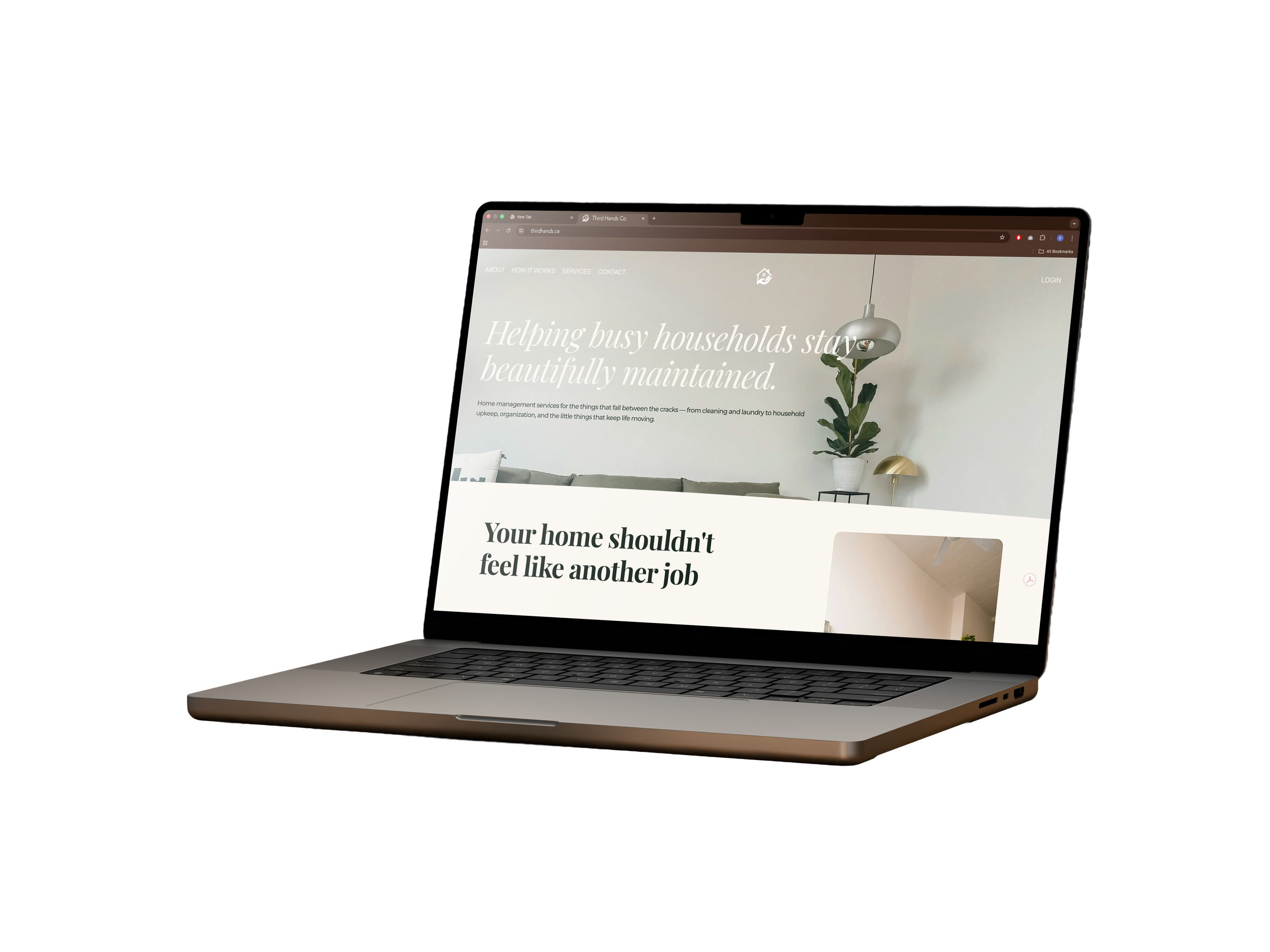

Web Design
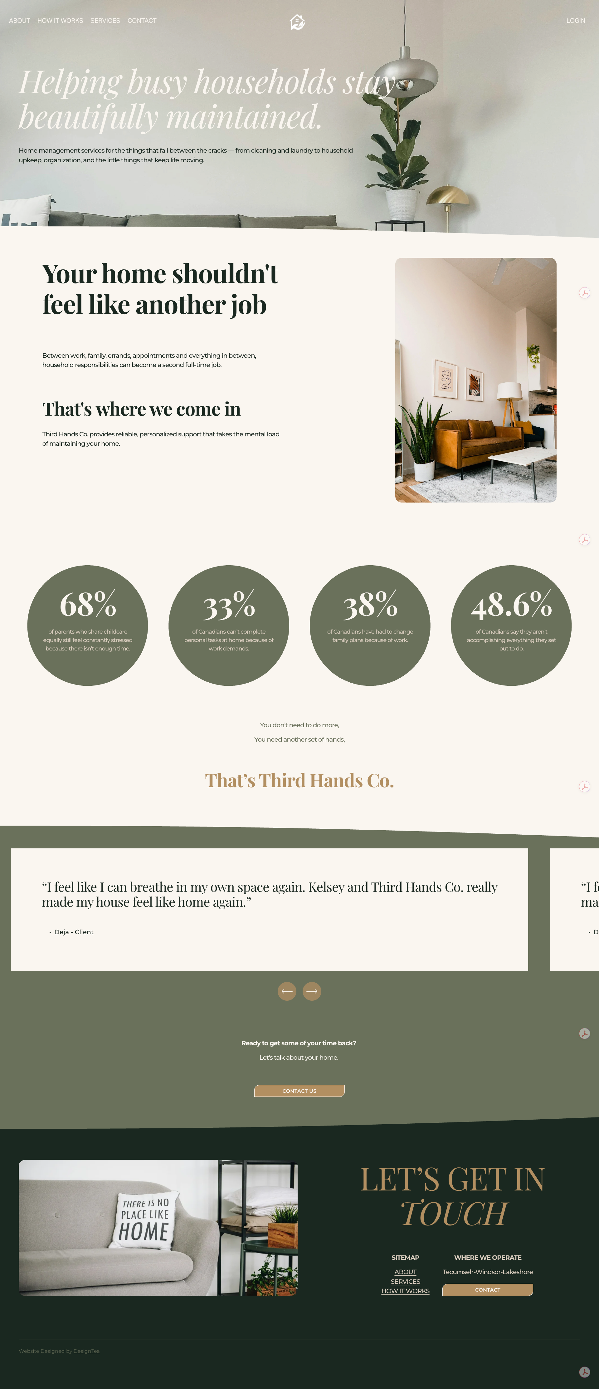
The overall website design was meant to showcase an aura of a “calm solution”.
We managed this through consistant communication with the client throughout the process, refering back to the imagery they provided us, and presenting idealisms through a inspiration and mood board.
The Target Audience
Third Hands Co. presented us with the target audience as:
“Professionals in busy workplaces, seniors who wish to remain independent but require some assistance, families caring for aging parents, and high-demand households.”
We were looking at a wide range of audiences from ages 35 or 40 to 80, all genders, but working professionals or those who lived busy lives and/or needed assistance of some kind.
How we laid down the target:
The website exudes more of a feminine, clean, and simple aesthetic. This direction showcases a more projected culture we were all raised with: “Women are the ones known for cleaning, therefore are good at it, therefore this company is what I’m looking for”. So we presented more of a soft approach to the webpage to give a sense of emotional understanding to the target audience, as well as an intellectual and professional understanding towards the business itself.
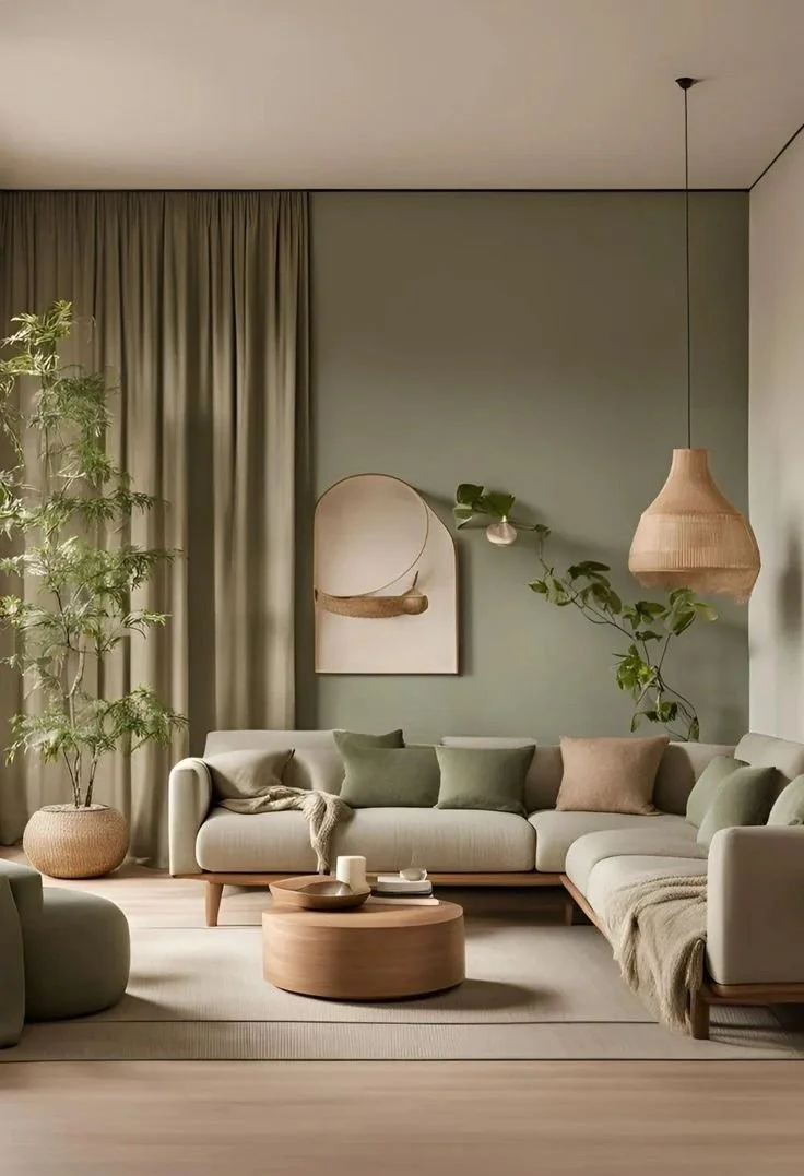
Mood/Inspiration Board


Each image above represents the colour palette, the mood, the feel of the home, and the overall calm that the website is meant to exude when a potential client of Third Hands Co. enters the website. The overall goal is to make the overwhelming experience of life that the potential client feels a little less overwhelming when presented with the website.
People love visualizations and representations of what they want in their life. The images were chosen based on the feelings they provide to the consumer of the media.

Third Hands Co. is meant to be the potential client’s “Third Hand” so that they can do what is more important to them: spending time with family, working on a major project, vacations and relaxation, and living their life without the worry of constant chores, work, or management of the household.

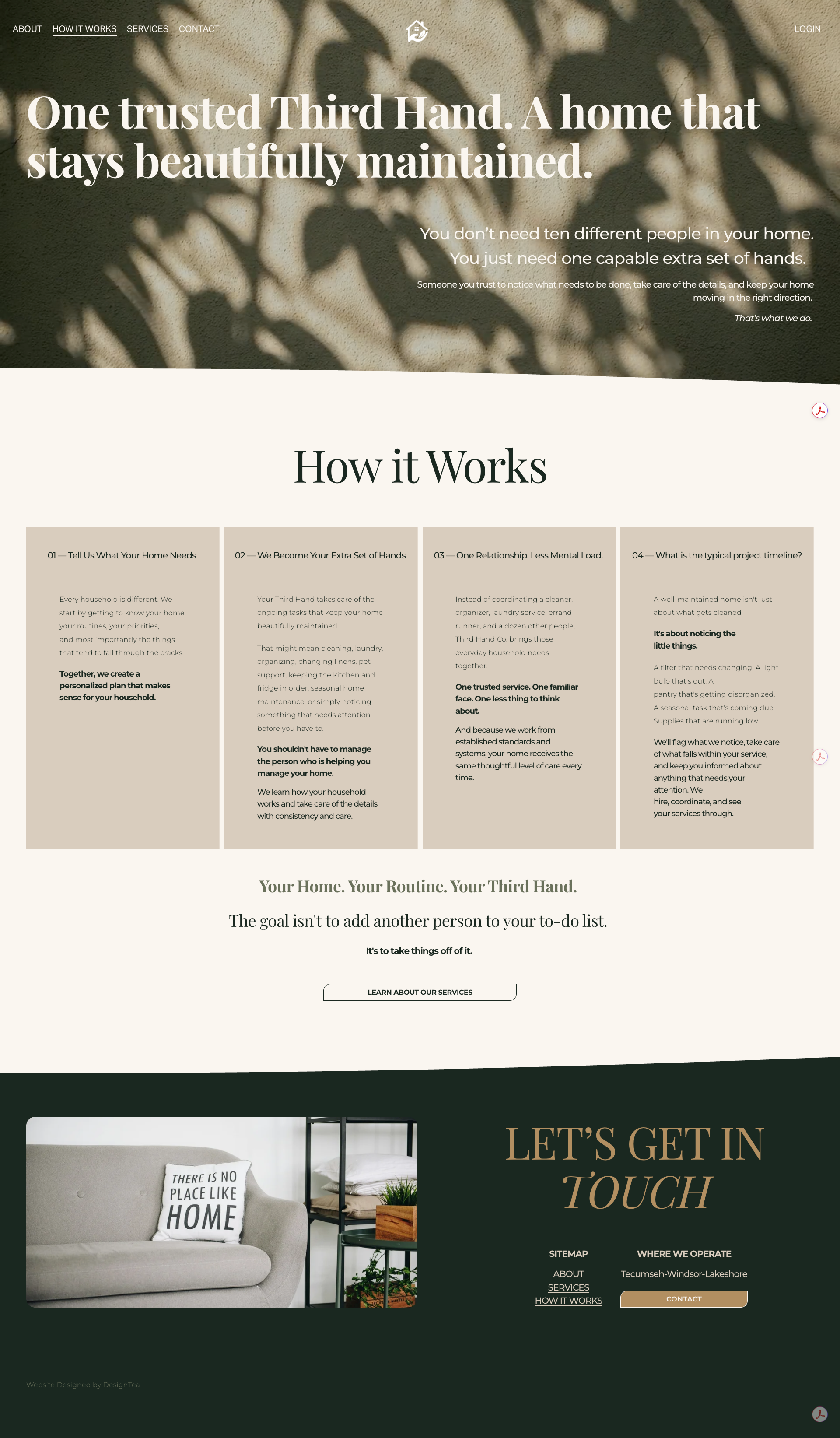
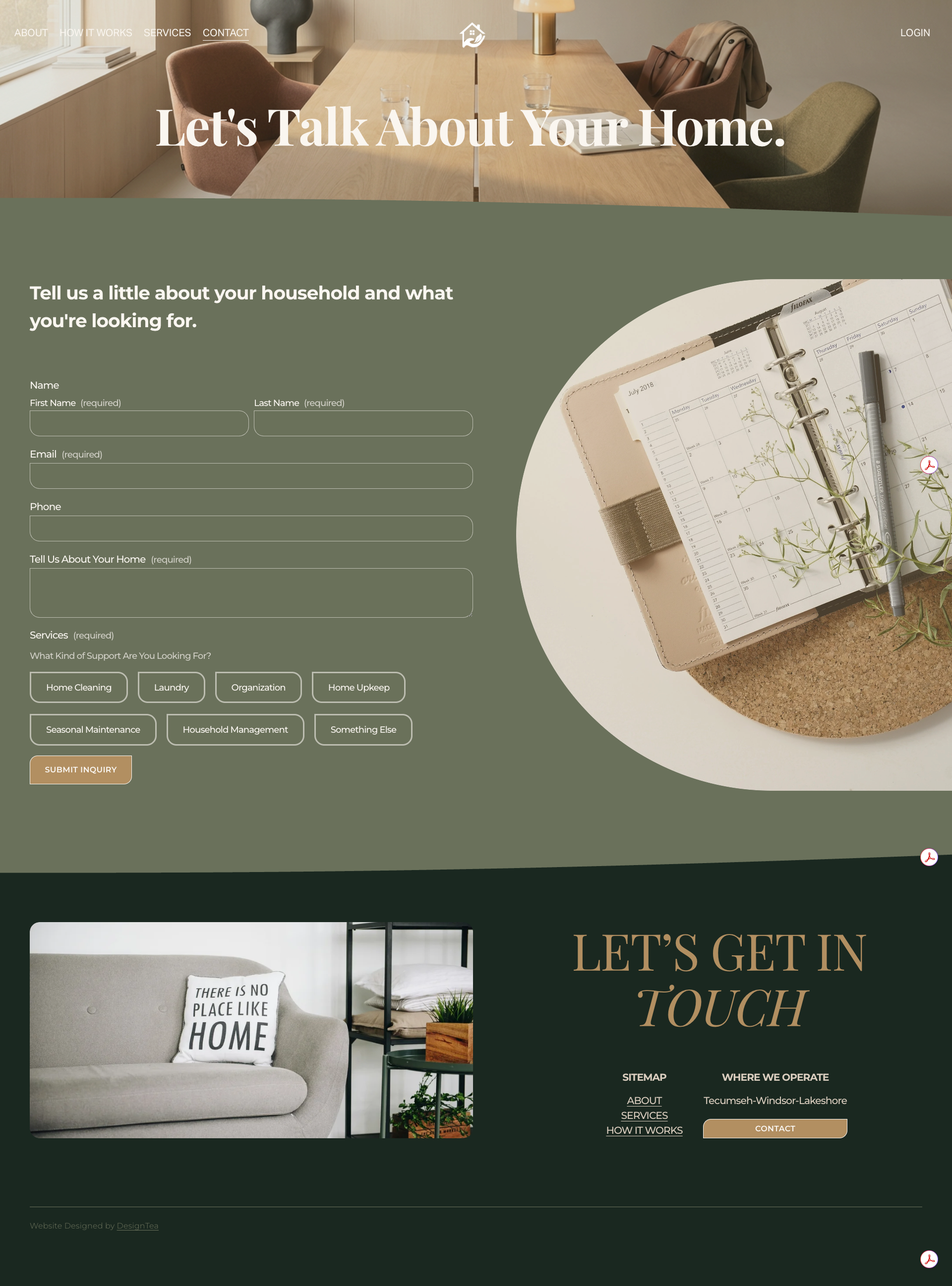
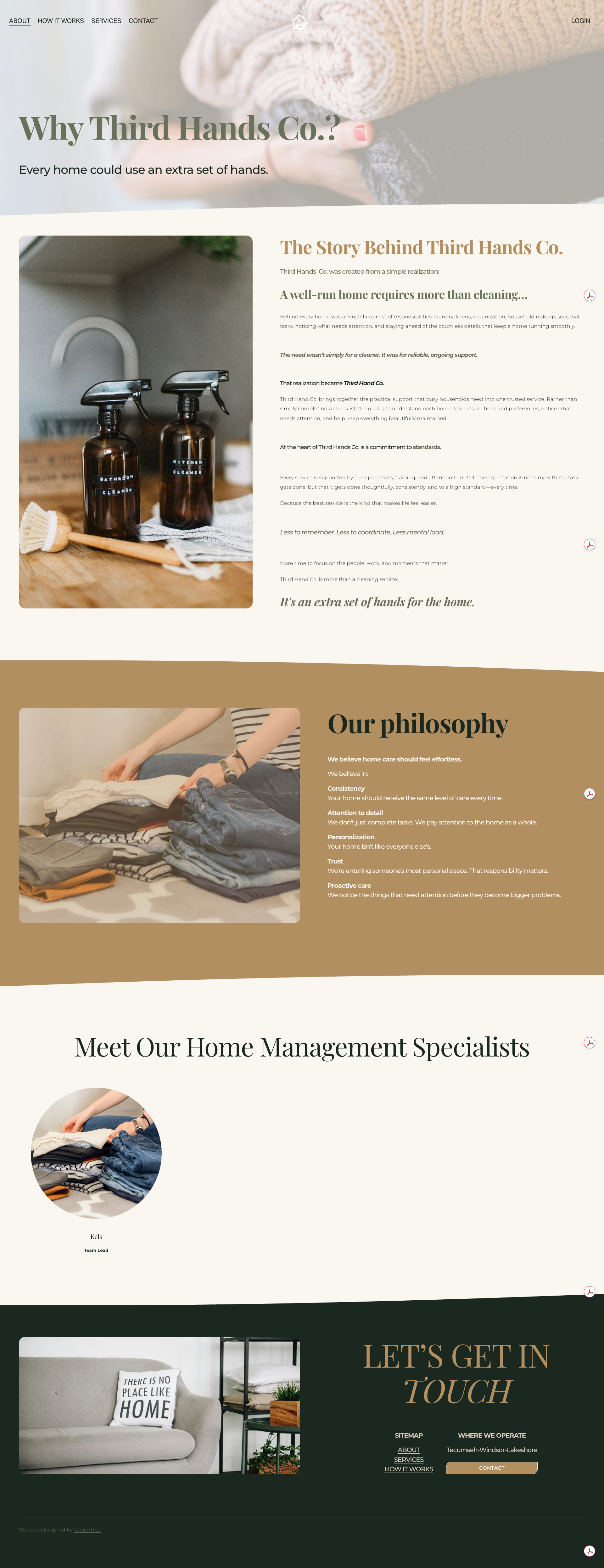
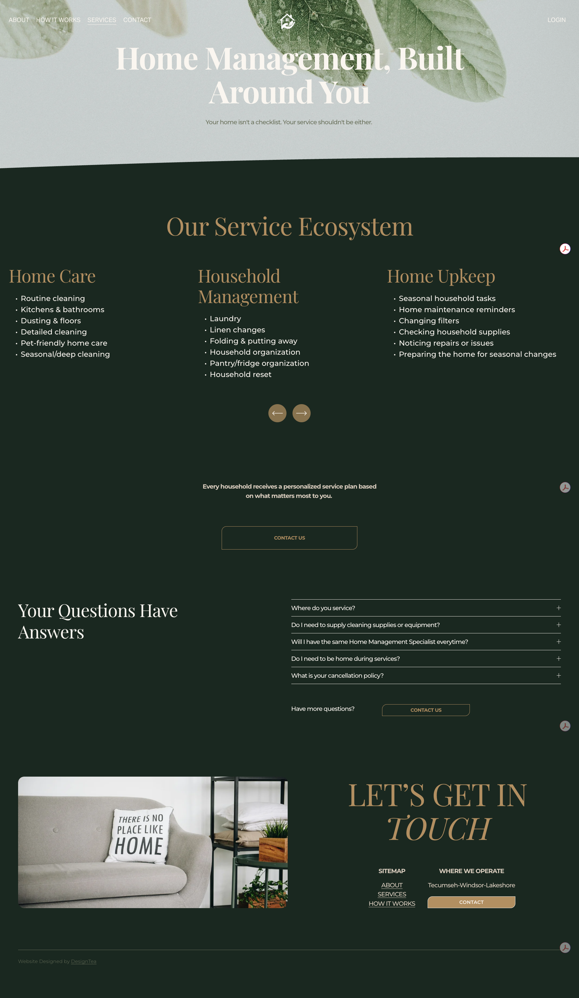
The Landing Page
The About Page
The How It Works Page
The Services Page
The Contact Page
Take aways
Impact
Reflections
Having a client who is fully prepared and knows what they want is rare and far between; but it is incredibly nice when they arrive.
Programs Used
Illustrator
Figma