
Logo, Branding, and Business Card Redesign
Creating a logo for an insolvency company with the goal of professional simplicity and not wanting to be overly perceived.

Insight.
Integrity.
Proven Results.
About Van Alphen & Associates
What I learned going in, and what I noticed about the client
Van Alphen and Associates Inc. is a Windsor, Ontario-owned and operated business whose goal is to provide debt solutions to operating businesses that may be struggling.
Van Alphen and Associates Inc. is a part of an industry that operates in the background of the finance world, providing companies security and privacy for their problems while operating as a support.
I noticed that the incorporation’s “Vibe” was what I would call a “Silent Hero”. They wish to be found and noticed by those who need them, but don’t want to be seen or known by the overall public. I kept that in mind.

Who are they and what does that look like?
What the client asked for, wanted, and communicated
When speaking with the client, the consensus is that the new logo, branding, and business card should be simple and professional while remaining inviting and engaging.
So, we started with that as a very broad base, then we added more: Masculine, Feminine, Gender Neutral? Geometric or natural? Bold or Delicate?
Once we established this, I looked at the main Insolvency Trustee’s personality, and correlated it with the average personality type you would see in a finance role, or a CEO role in a general business setting. This would help me see what the average client would be looking for visually when looking for a insolvency trustee.
So to solve this, I worked with colour, psychology, and analytics to make the product.
Lets talk colour
Colour theory is my jam
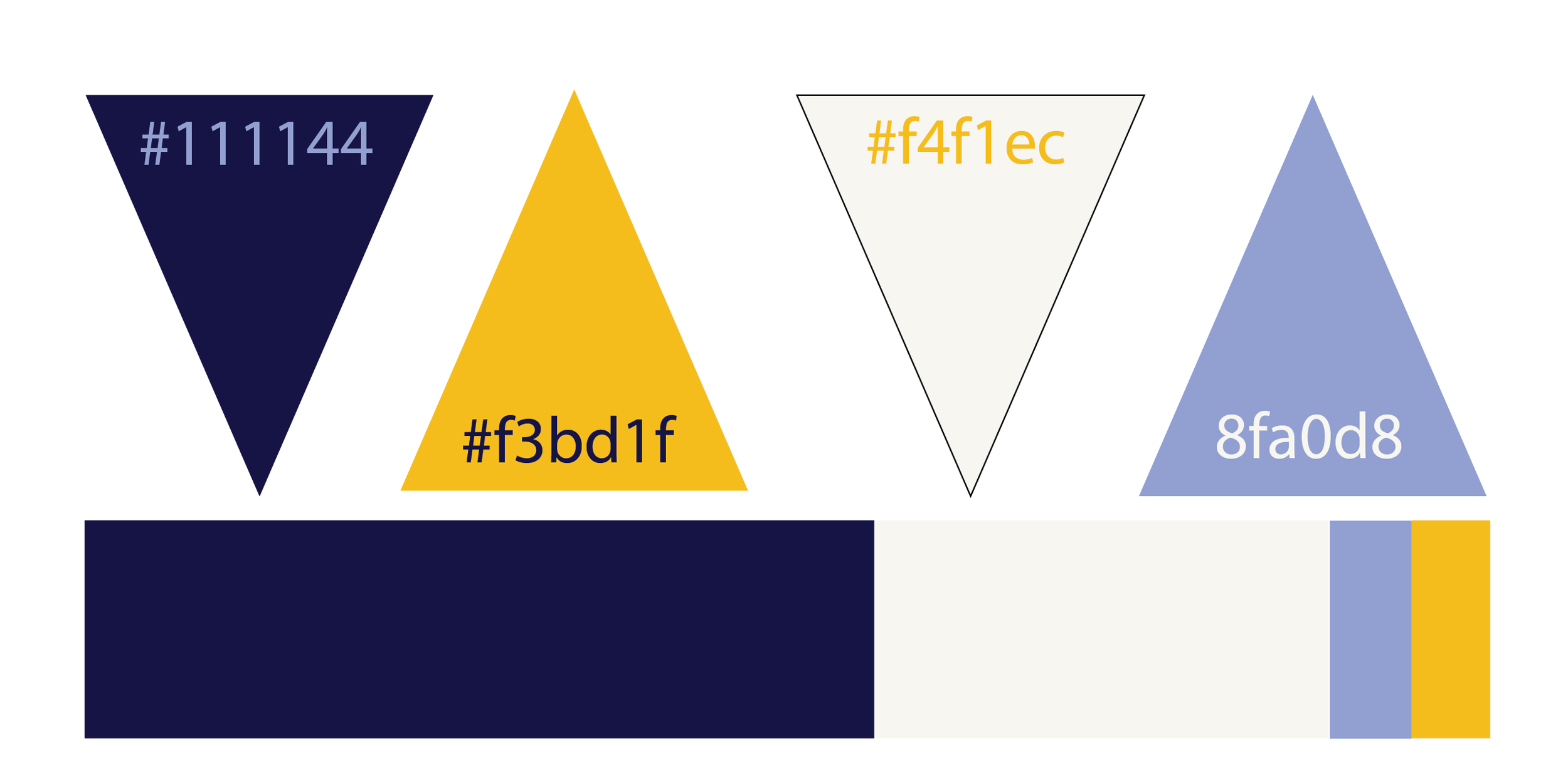
Overall, from questioning who the audience was, I gathered that the average CEO is male and looks for more of a masculine look in visuals. Blues, Golds, and Whites are the average colours they look for, since colour psychology showcases this is the colours that (In North America) represent the feeling of trust, honesty, success, healing, purity, and hope.
These are the feelings that a business in crisis and its CEO are looking for on a deeper psychological level.
Blue is also one of the more commonly used colours in banks (See: Bank of Montreal, RBC, Bank of America, or Citibank as examples).
With this knowledge, I built a palette that has both deep and lighter tones and scaled them out to what will be more commonly used throughout the branding.
Typography
That’s Their Type
The Insolvency Trustee that I worked with throughout the process really gave me an idea of how the type should be chosen.
She reminded me of these words:
San Serif Fonts
Bold
Clean
Simple
Driven
Avant-Garde
Assertive
Upfront
Honest
Professional
Stands Tall; and
Professional
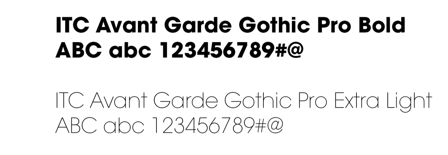
I narrowed them down, and one term hit me more than the others: Avant-Garde, which is a font that fit the narrative that we were trying to establish.
Creation of the Logo
Make it stand out.
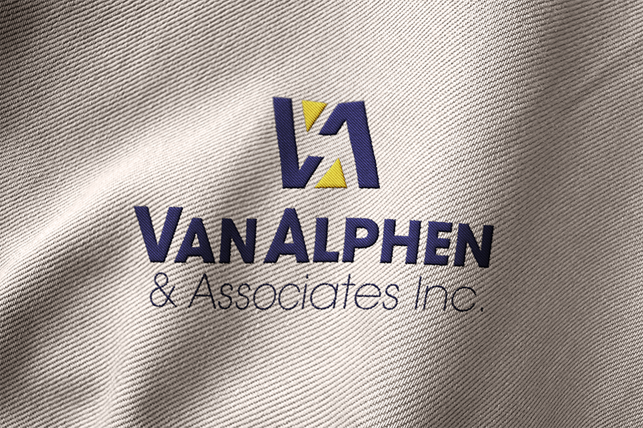
The type portion was easier after I matched personality to font; I wanted something that was bold to capture the eye and keep the eye on the name of the main associate who owns and operates the business. As the sole proprietor, their name needs to be remembered, and their voice needs to be heard. So I boldened the name and made Associates Inc. much lighter to keep the overall spotlight on the sole proprietor.
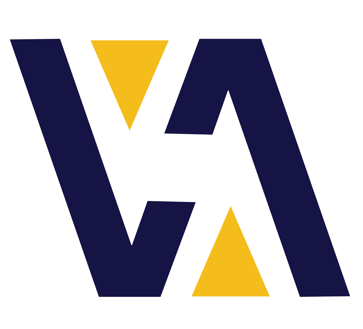
The iconography was created by combining the two sections of the last name, allowing the V and A to create a check mark pattern and gaining the ability to have to visual as a rotational abigram. This will allow any form of print media to have the iconography always facing upright and recognizable at first glance.


Assets for decorative design
Even Finance Bros need some whimsy in their lives.
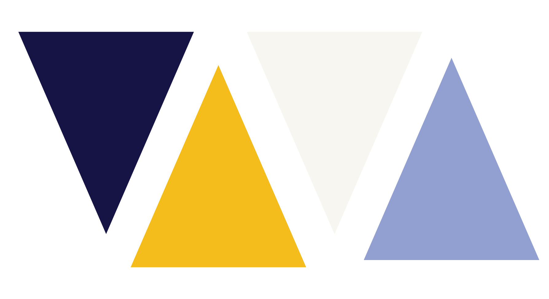
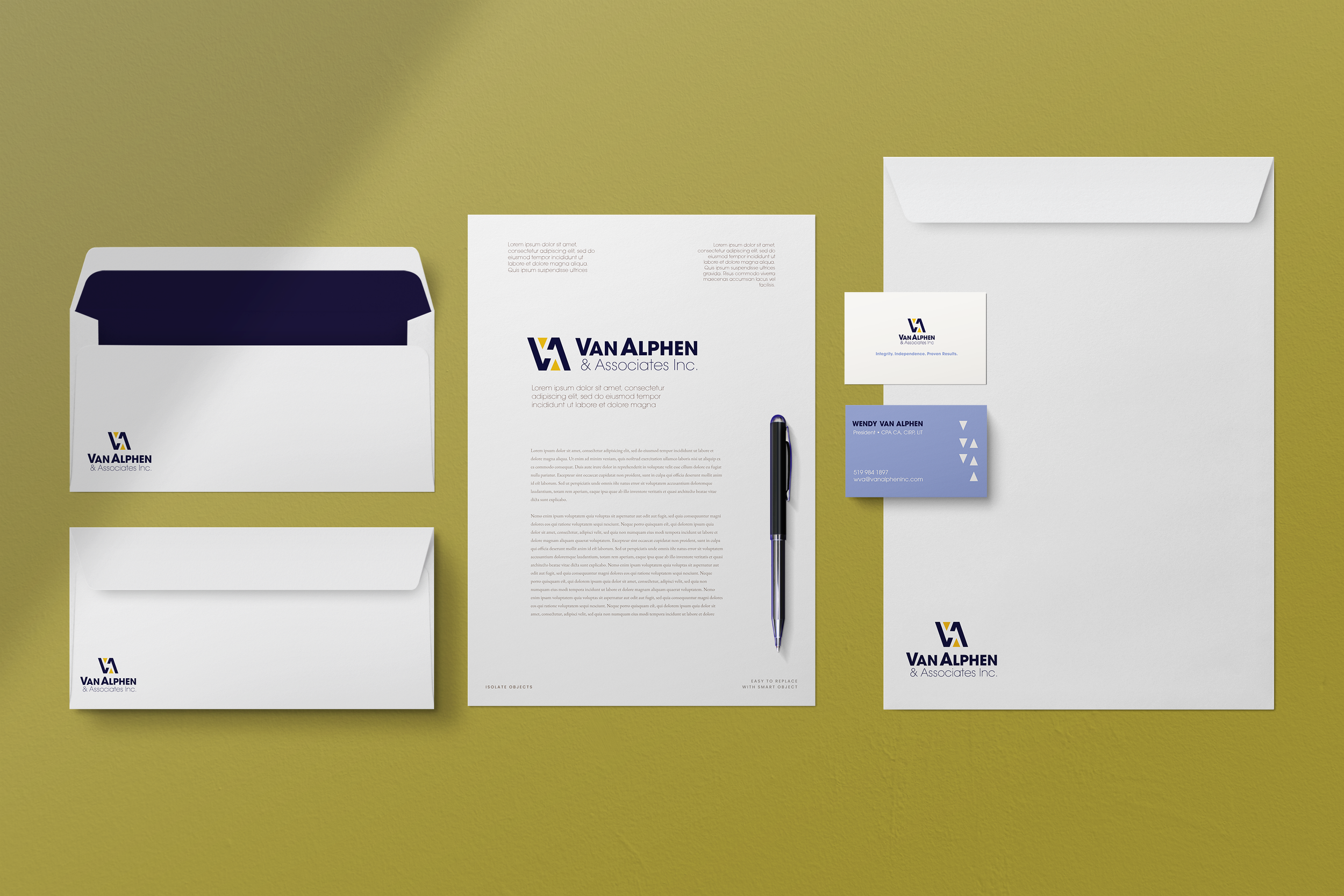
In addition to the logo, I pulled some of the iconography out of the main Icon to create some symbolism for potential future projects for the client. I kept them synced with the main logo to stick with the brand but allowed them to become playful to keep an ease with the audience.
Not everything in insolvency should be completely serious; it’s such a delicate area to tackle, the emotions are high, the urgency is set to max, and having a visual that is completely serious can amp up the stress.
So, we allowed the geometric shapes to have some play to the gambit.
Let’s get down to Business
To create a card

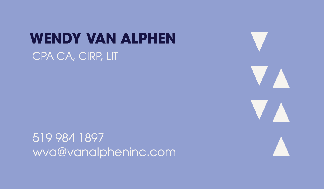
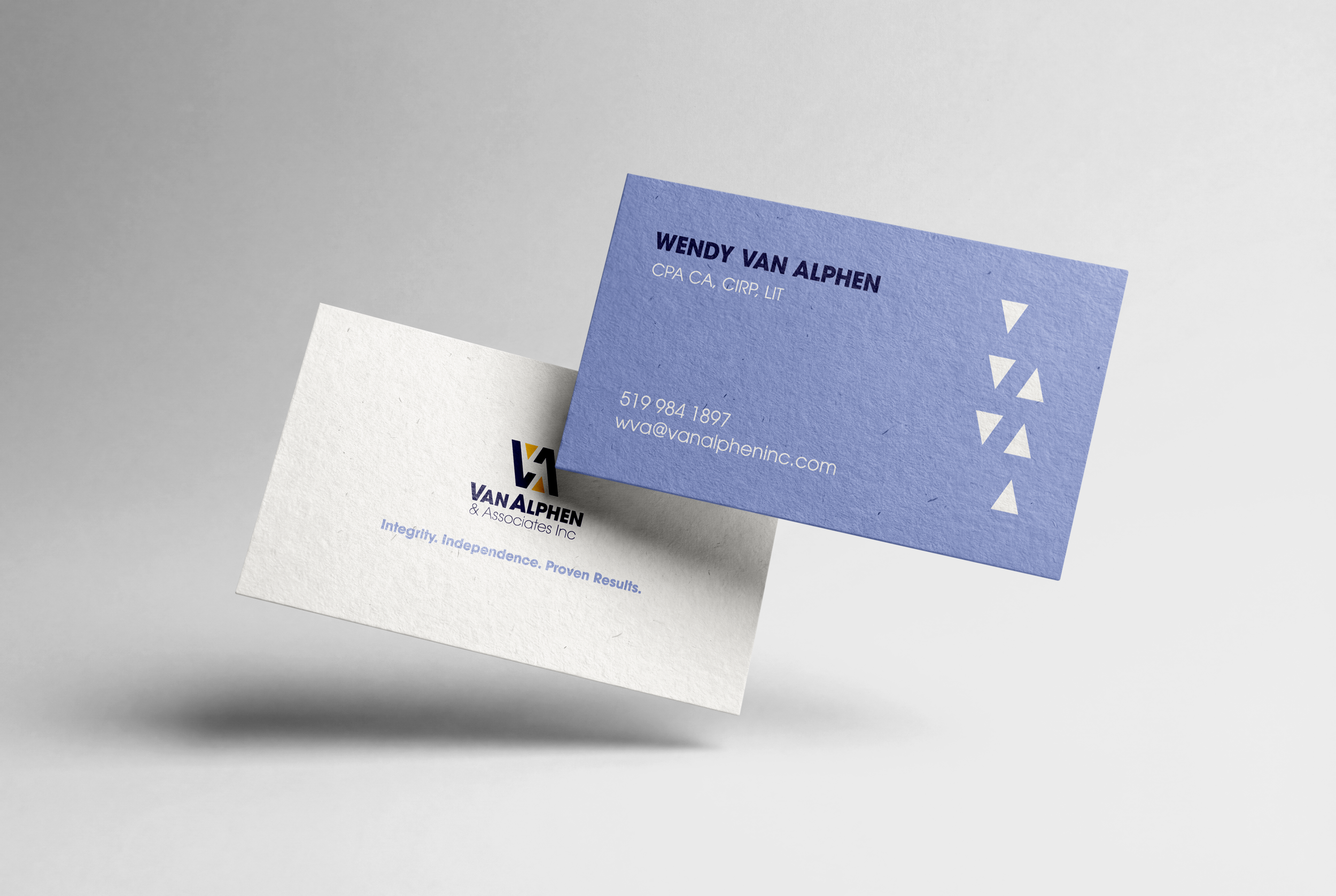
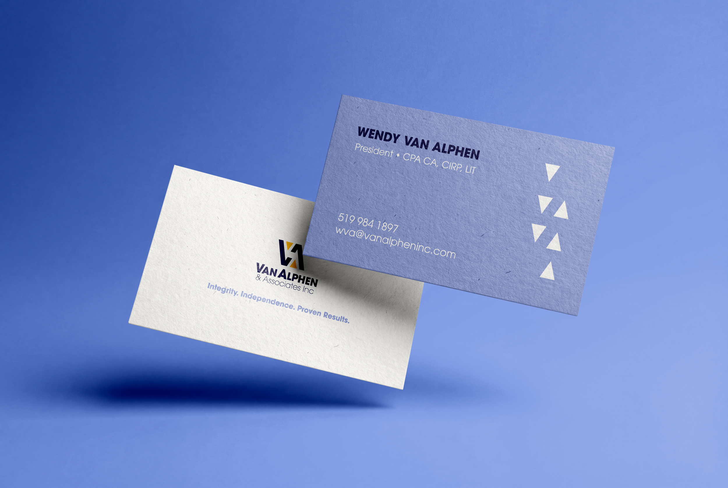
The business card was something that allowed the sole proprietor to showcase themselves as not just a business but a human.
Takeaway
Insolvency is part of a more emotional field than we think it is (it’s not just finance). It’s a career that deals in loss and hardship of something that was built up.
Tactical emotional literacy is needed in the overall “scheme” of things.
Impact
By humanizing the brand while keeping the look professional, we were able to establish a look and feel that will speak to the intended audience with a nonjudgmental, healing, and hopeful voice while providing the encouragement of success and integrity needed.
Reflections
Emotional storytelling can come from places you don’t expect it.
Sometimes a tagline can help give a “punch” or “pop” to things.

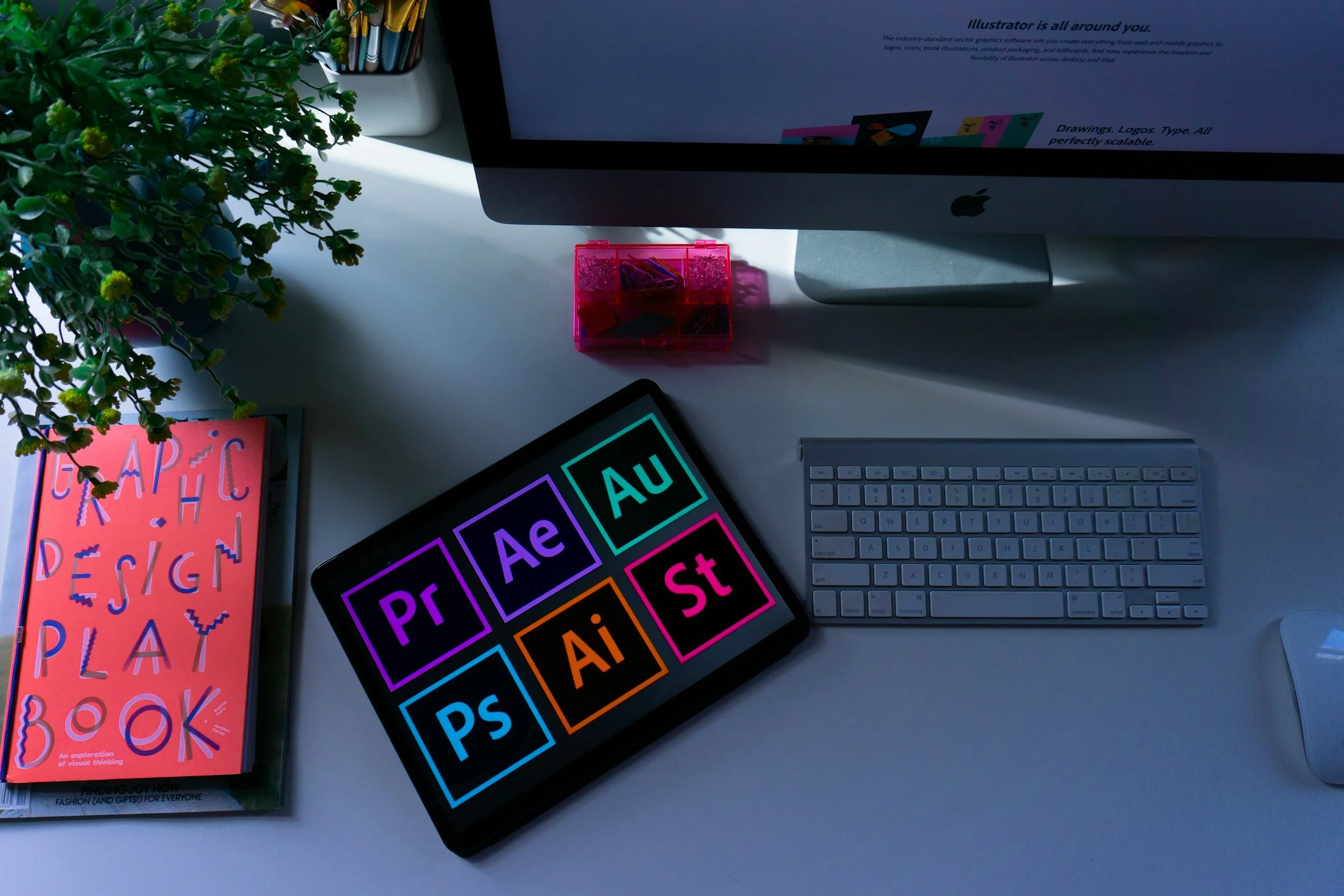
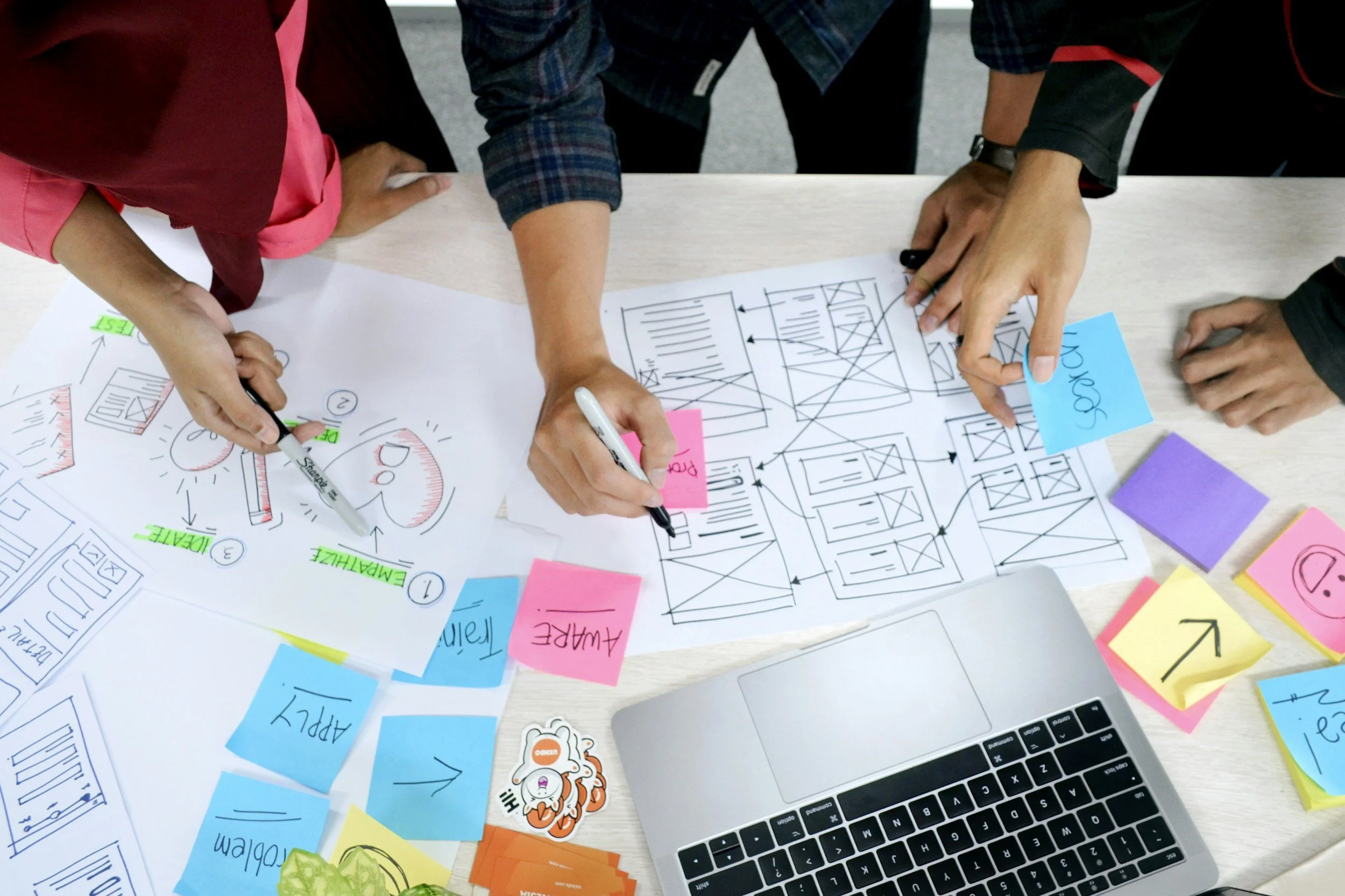
Programs used for this project
Adobe Illustrator
She's workin' good today bois
Procreate
Not that kind
Pencil and Paper
Oldie but a goodie